Designing Digital Experiences That Drive Action: Visual Principles That Convert

If your SaaS product looks great but isn’t converting, the problem isn’t the aesthetics; it’s the intent behind them. Great design isn’t decoration. It’s persuasion. Every color, layout, button, and block of space should serve one purpose: moving the user to action.
Studies show that users form an impression of your brand in less than 1 second, and if that impression lacks clarity, they bounce. In fact, according to Google, visually complex sites are consistently rated as less beautiful and more confusing. Clean layouts aren’t enough. Users need directional cues, emotional resonance, and quick value recognition.
So, what separates design that looks “clean” from design that drives results? Visual strategy. Below are the principles that top-performing companies use to turn views into signups, trials into upgrades, and curious visitors into loyal customers.
Start with visual hierarchy
Most users make a judgment about your product in under 50 milliseconds. That means your design needs to communicate priority instantly. Visual hierarchy is your silent sales pitch—and it starts before a word is read.
Want users to convert faster? Start by showing what matters, and show it well. Omi’s approach to next-gen product imagery is a great example of this in action. Rather than relying on static visuals or generic mockups, they use dynamic, highly contextual product imagery that aligns with user intent. The result? Users immediately grasp the value, reducing hesitation and driving quicker decisions before a scroll or click.
Visual hierarchy guides the eye through your interface in a logical order. It's about signaling, not shouting. The headline leads to the subhead. The subhead points to the CTA. Supporting info hangs back until needed.
Make your most important message unmissable
Limit each screen to one clear call to action (CTA), and visually mute secondary actions
Use directional cues like arrows or image gaze (e.g., a person looking toward your CTA)
Apply intentional sizing: Headline > Subhead > Button > Body copy. And don’t let icons overpower
Test the “blur test”: Can you still tell where the action is when the screen is blurred?
Whitespace isn’t empty, it’s strategic.
Whitespace, or “negative space”, isn’t wasted real estate. It’s the room your content needs to breathe and be understood.
When layouts are too tight or busy, users don’t know where to look. Their attention scatters, and even great messaging can get lost. The most confident brands let whitespace do the heavy lifting.
In mobile design, especially, whitespace often gets sacrificed. But if your mobile experience feels cramped or overwhelming, you’re probably losing users before they reach the CTA.
Let your content breathe and your message land
Use whitespace to create visual “islands” for important content to improve scannability
Set a consistent vertical rhythm (e.g., 8px or 16px spacing units) to avoid visual clutter
Break long-form content with line breaks, bullets, and collapsible sections
Resist the urge to “fill space”; sometimes the strongest message is the one that stands alone
Consistency is a trust builder
You know what inconsistency looks like: three different button styles on one page, fonts that don’t match, erratic spacing between form fields. This isn’t just annoying for the eyes. It kills trust.
Users associate consistency with professionalism. When your visuals feel cohesive, so does your brand. When they don’t, the cognitive dissonance distracts users from converting.
Take Figma, for example. Their interface is a masterclass in visual consistency: button styles, color schemes, and spacing stay locked in whether you’re designing a frame or inviting a teammate. That level of predictability helps users build trust fast, especially when they’re working across teams or devices.
Build credibility through design discipline
Create a simple design system with basic spacing, font, and button rules
Use design tokens or shared components if you're working in tools like Figma or Webflow
Review critical flows (sign-up, checkout) monthly for styling drift or rogue elements
Use a UI linting tool or plugin to flag spacing and style inconsistencies
Contrast creates clarity
Without contrast, your design is just… gray soup. Contrast is what guides users toward the most important parts of your interface. It doesn’t just make things pop, it makes them matter.
Humans are visual animals. Our brains are wired to notice differences. Bright colors against muted tones, large text against smaller, bold elements next to neutral space - this is what catches attention and triggers engagement.
Example: Notion’s interface uses calm, almost empty screens, except for a single, high-contrast CTA button. It pulls your eye immediately, without feeling aggressive.
Guide attention with visual tension
Limit use of your primary color to CTAs and key UI elements; this makes them more impactful
Use contrast in text hierarchy too: not everything needs to be 16px black
Run contrast accessibility tests (like WebAIM) to ensure readability for all users
Explore contrast through size, weight, shadow, and whitespace, not just color
Microinteractions are the difference between static and smart
Click a button. Nothing happens. Did it work? Is the site broken? Am I supposed to wait?
Welcome to the world of poor interaction design.
Microinteractions, AKA those tiny animations, hover effects, and loading indicators, create feedback loops that guide users through your product. They offer confirmation, reduce uncertainty, and often make the whole experience feel faster and more polished.
Another example? ClickUp. Every hover, drag, or dropdown interaction gives feedback that feels both snappy and satisfying. These micro-movements train users on how the product works, reducing confusion and speeding up onboarding.
Use feedback loops to reduce friction
Add hover states and click effects to all interactive elements, even icons and cards
Use animations to show progress (e.g., upload bars, step transitions)
Include microcopy with error states (“Oops, that didn’t work, try again”) to reduce frustration
Keep microinteractions subtle: 0.2 to 0.4s transitions are usually optimal
Forms Should Feel Effortless
Forms are where your conversions happen, or where they often go to die. A cluttered form with vague labels or 10 required fields is a conversion killer.
The best forms feel invisible. They guide users from input to completion with minimal friction and maximum clarity. Think of every field as a potential point of dropout. Unless it's absolutely necessary, remove it, or delay it until later in the flow.
Bad forms introduce doubt: Do I really need to give my phone number? Will I get spammed? Is this even secure? These questions slow users down or push them to abandon entirely. A smarter form anticipates concerns and removes obstacles.
Design inputs that feel natural, not annoying
Use smart defaults and auto-fill fields where possible (especially on mobile)
Apply conditional logic so users only see relevant fields; no more “N/A” in dropdowns
Show a progress bar or step counter to reduce perceived effort
Make validation real-time: errors should show before submit, not after
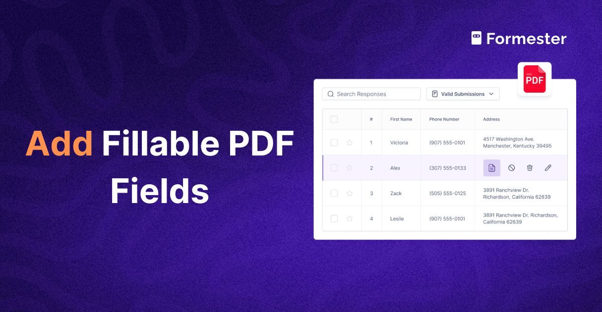
Formester makes this level of UX achievable without writing a line of code. Its visual form builder supports conditional logic, field validation, and responsive layout by default, so even non-technical teams can build clean, user-friendly forms that convert.
Remember: Speed and performance are part of the visual experience
Even the best design fails if it loads slowly or breaks under pressure. In modern UX, performance is part of the visual impression. If a button animation stutters or your landing page takes 4+ seconds to load, it creates friction before the user even reads a headline.
Fast-loading, responsive design gives your visuals room to shine. Use lazy loading for images, compress assets, and test interactions under real-world network conditions.
Consider how product imagery loads, too—Omi, for instance, optimizes high-quality visuals without compromising speed, ensuring clarity doesn't come at the cost of performance.
Don’t Just Design. Direct.
Too many companies treat visual design like a finishing touch. As something you polish after the “real work” is done.
Effective visual design reduces friction, builds trust, and moves users through your funnel with less hesitation and more clarity. When every element is purposeful - every headline, button, whitespace block, and interaction - you create an experience that’s not just nice to look at, but engineered to convert.
The best-performing teams don’t separate design from outcomes. They treat UX like a growth lever. Whether you're refining your onboarding flow or rebuilding your landing page, don’t aim for pretty. Aim for persuasive. Aim for clarity. Aim for action.
Because good design doesn’t have to win awards. But it does need to win conversions.