Website and Form Design Trends 2025
The world of web design never stands still.
Each year brings about changes due to new technologies, shifts in user behavior, and evolving design aesthetics.
And these changes affect your website and online forms more than anything. After all, they are the heart of your customer’s digital experience. Your website is where first impressions are made, while your form is where the impression turns into action. If they are clunky or outdated, you’ll risk losing connections where it matters the most.
That's why we gathered the top website and form design trends for 2025 below. These trends don't just modernize your site or make it look cool, but rather make it more engaging and user-friendly - all of which can help you stay ahead of the pack.
Top 10 Website and Form Design Trends in 2025
1. Smarter Personalization
Personalization isn’t anything new. But in 2025, it’s becoming even smarter.
Gone are just simple “Hello, [Name]” greetings or changing the language to the user's location. Today's website adapts to the intent, behavior, or preferences of users in a more natural rather than intrusive way.
An example is Spotify. Aside from giving you song and podcast recommendations based on your listening history, they also curate playlists that contain songs or artists that you haven’t listened to yet but may fit your music taste.
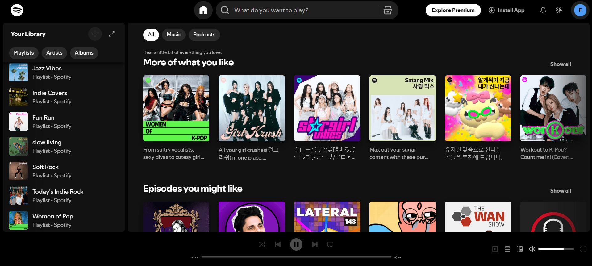
Spotify Website
Content can also vary depending on where the user is in their buying journey. You can see it in sites like ASOS. New users will get a first-purchase discount voucher, while returning customers are offered a chance to upgrade their membership.
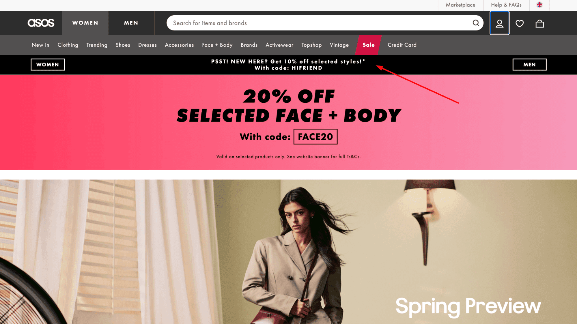
ASOS New Users
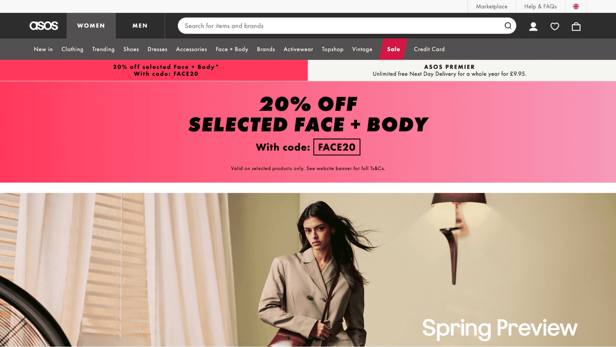
ASOS Returning Users
Headlines, CTA, or pricing can also change depending on your user data. For instance, a B2B site can consider the size of the company you are working for to give you a product plan that is more relevant to your needs.
Clearbit Website
2. Low-Light Environment
Dark mode has since become a standard rather than a nice-to-have.
This is why designers are now looking to evolve and improve the trend further. This leads to the new low-light trend, where websites now come in muted palettes like soft gray or charcoal, lower contrast tones, and dimmed highlights (instead of having to toggle between white and dark).
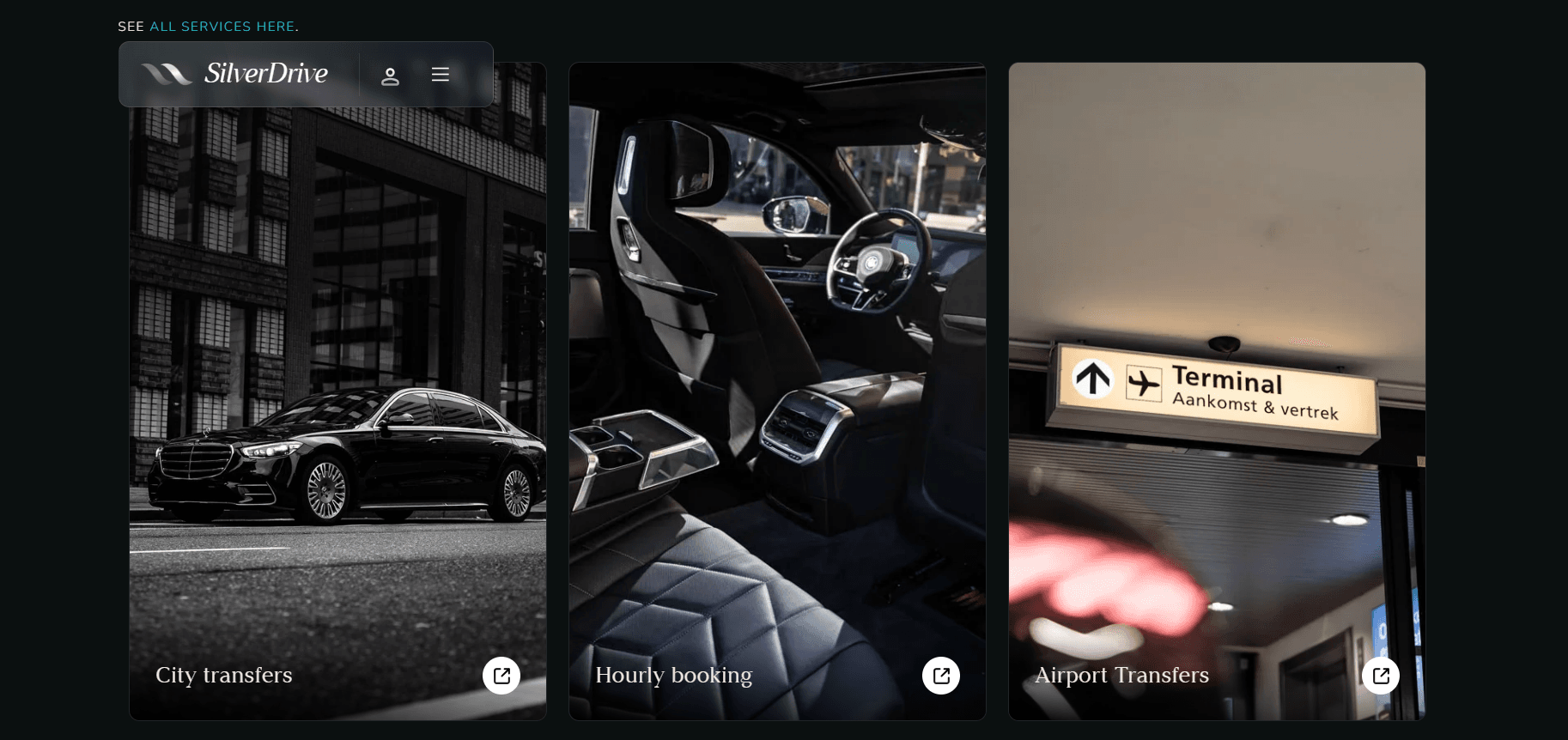
Silver Drive Website
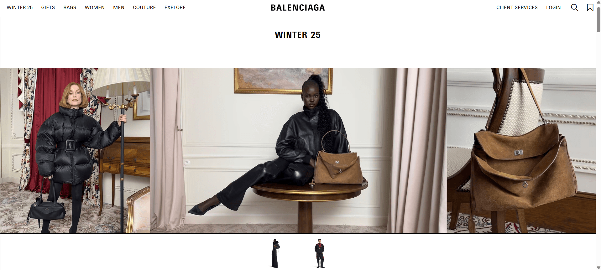
Balenciaga Website
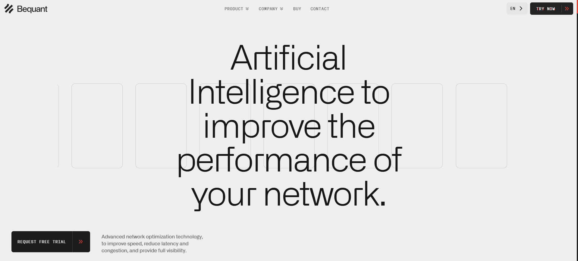
Bequant Website
This low-light trend balances accessibility and aesthetics. Lower-contrast environments are less straining to the eye and make it easier for people to focus. At the same time, they also give your site a moodier or more relaxing vibe, which can enhance storytelling or reinforce your brand’s identity.
3. Bold Typography
Typography is stepping into the spotlight this 2025, mainly thanks to the rise of brutalism and retro aesthetics. This is why you’ll see more sites that feature expressive fonts, oversized text, and unconventional arrangements.
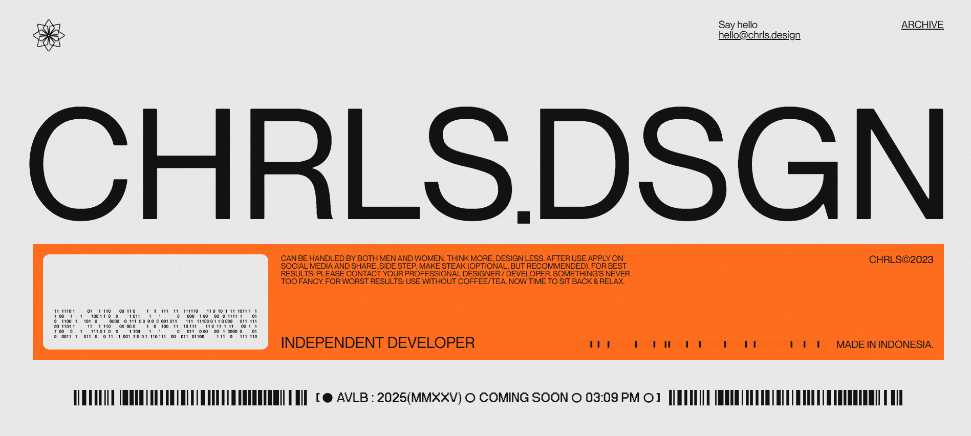
CHRLS.DSGN Website
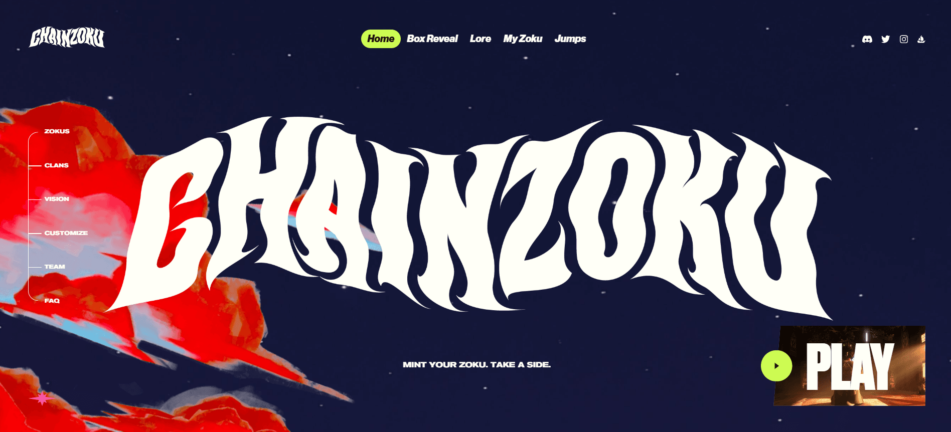
Chainzoku Website
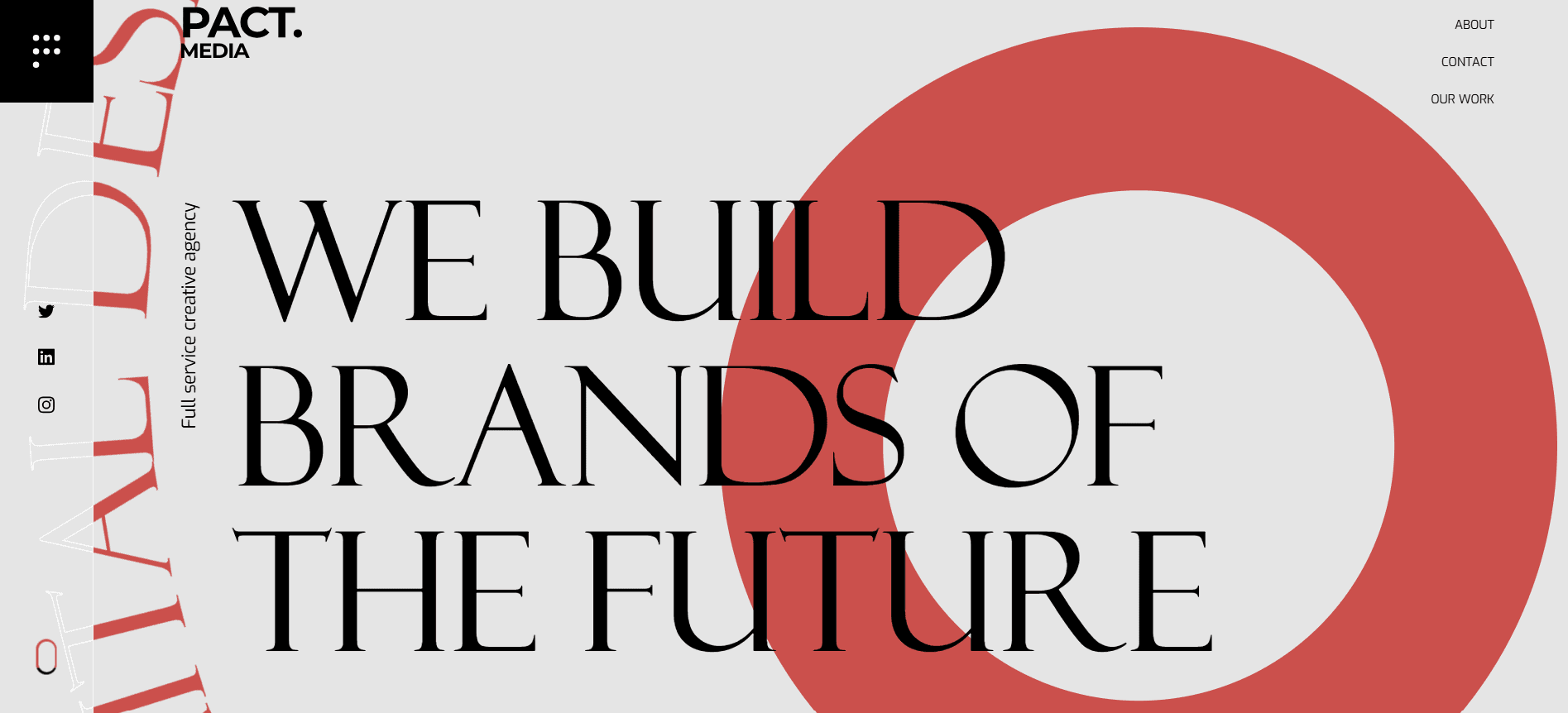
Pact Media Website
Creative typography like this allows brands to convey their brand’s personality and story without relying too heavily on image. Plus, it creates a more memorable visual impact – people will remember a site with unique fonts compared to a site that uses plain old Helvetica.
Want to try out the trend but worried it may be too much for your users? Try it out first with an AI website builder. One can just input a related keyword, e.g., “90s vaporwave” or “metallic punk rock,” and you’ll instantly get a sample website with suitable design and typography. This can help you decide if this unconventional website design fits your brand without spending too much time and effort.
4. Bento Grid Layout
The minimalism trend is still going strong, but this year, it has a new application in the form of a Bento Grid layout.
This layout features a modular, card-like layout inspired by the grids in a Japanese bento box. This allows you to present various information while still having a clean, tidy, and distraction-free design.
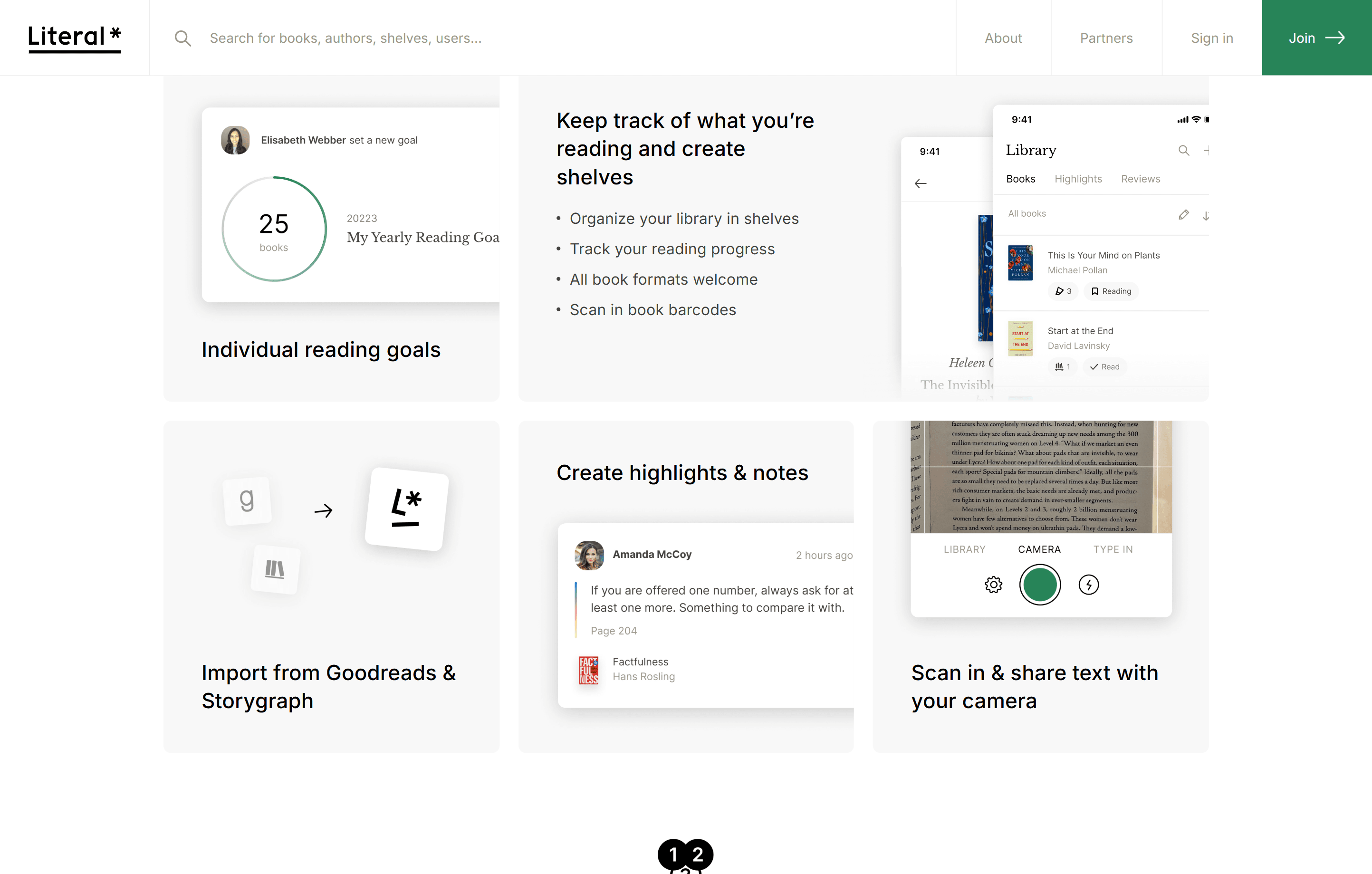
Literal Website
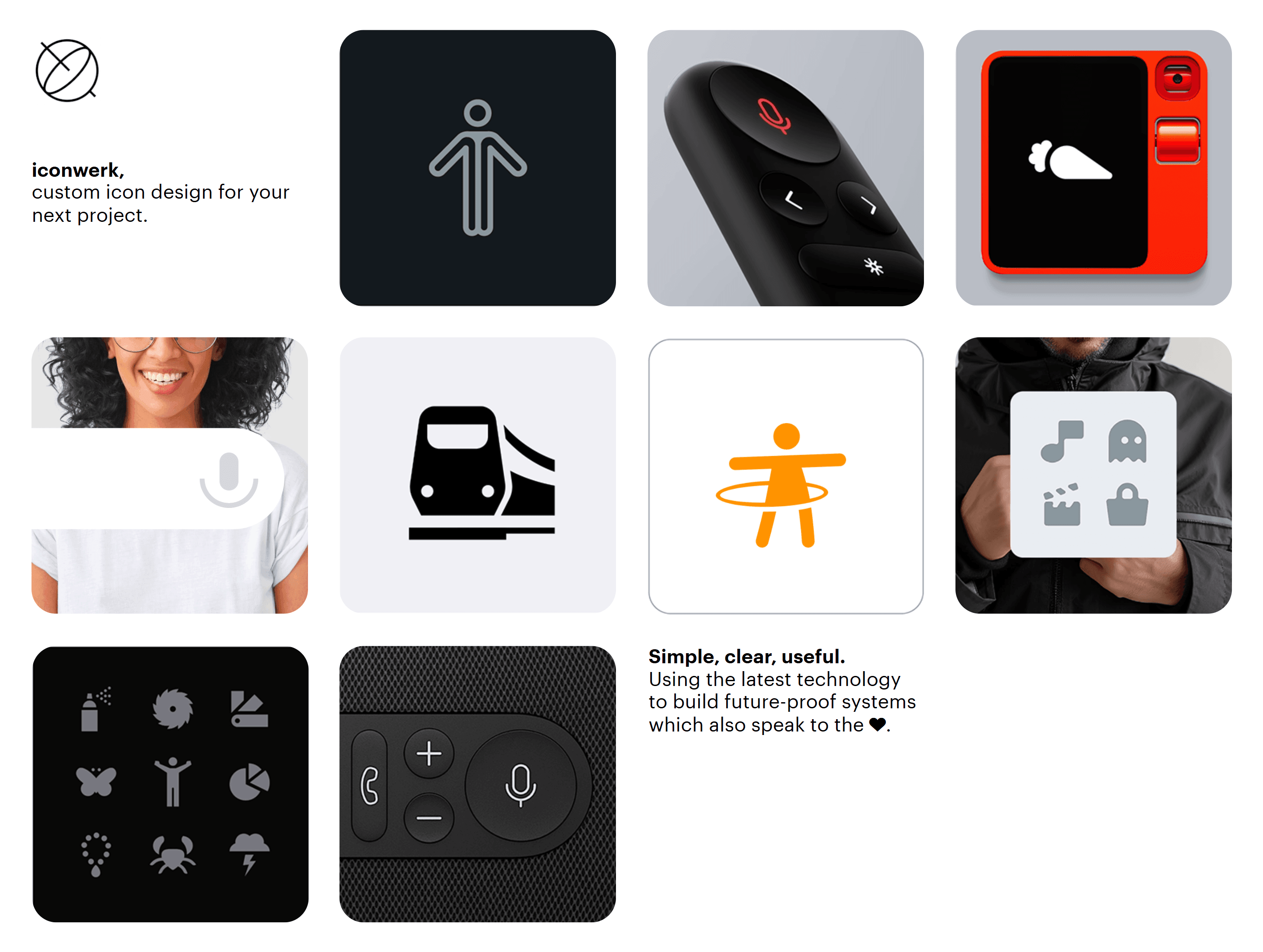
Iconwerk Website
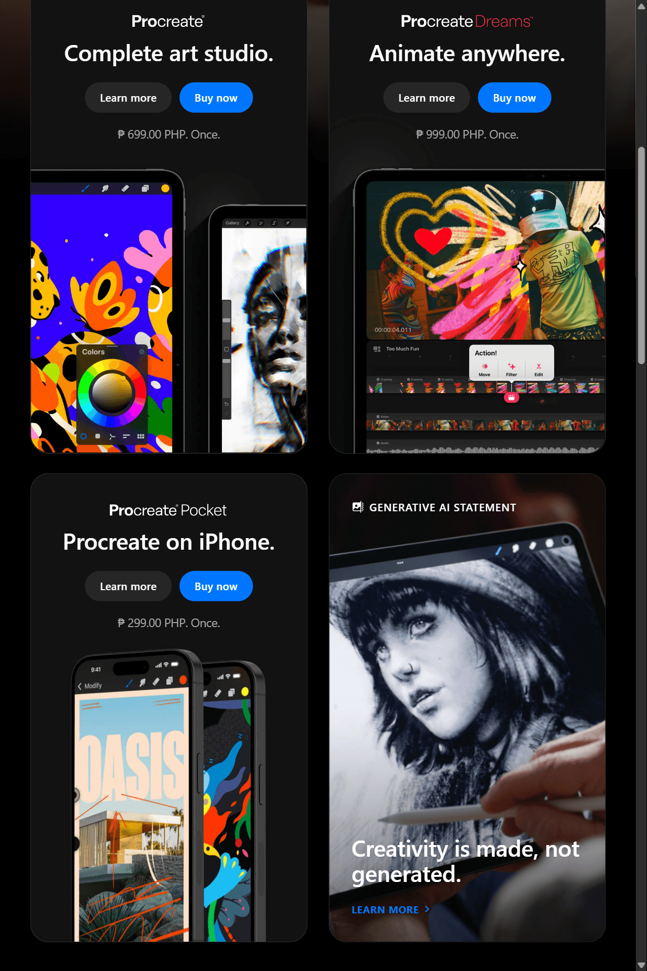
Procreate Website
This trend also allows designers to add a touch of creativity in their designs without overwhelming their users. For example, they can use the grids to guide users through a narrative sequence or add micro animations like hover or sliding effects.
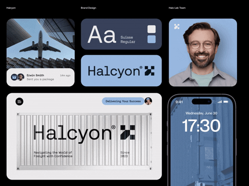
Halo Branding Website
5. Experimental Navigation
And while usability and minimalism are still top of mind, some brands are looking for more creative ways for visitors to explore their sites. This then gave way to the rise of more experimental navigation styles like parallax scrolling, horizontal scrolling, and interactive maps.
A great example is Pixlspace’s website. As you can see, each scroll is a visual feast, fitting branding for a creative agency.
![]()
Pixlspace Website
Another is Gapsy’s Studio’s horizontal scrolling website, which takes you on a “tour” around their office.
This trend adds immersion, novelty, and storytelling to a typical website experience, which can help your brand stand out in your users’ minds.
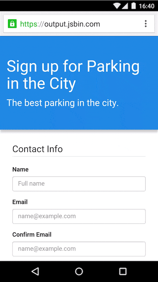
6. Conversational Forms
Forms used to be the boring, transactional part of your digital experience.
But this year they are getting a makeover – by getting more friendly, conversational, and “human.”
Conversational forms now say “Whoops! That doesn’t seem right” instead of a simple “Invalid Password”. Or a “**Where to?” instead of “Enter location.**”
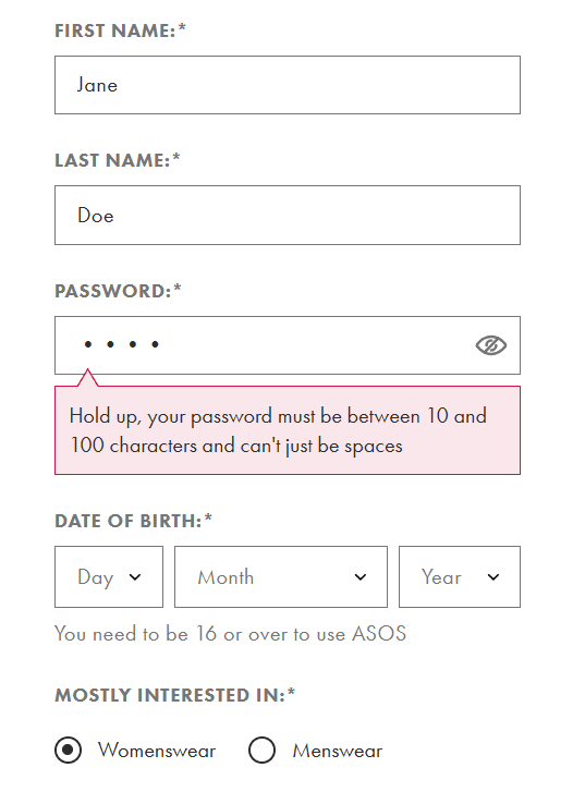
ASOS Website
By framing prompts in a conversational tone, what used to feel like tedious data entry becomes a more natural back-and-forth. This also gives more cues or explanations to the users, which can help them take the right action. This keeps users engaged and less overwhelmed or frustrated, which naturally increases the completion rate.
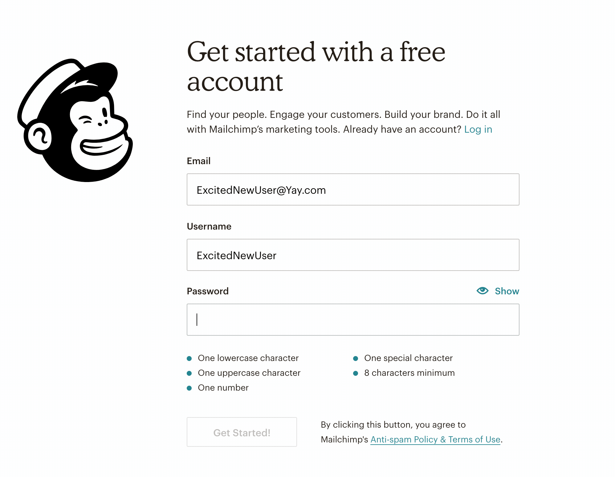
Text like this also allows brands to showcase their personality compared to the robotic language of before. Mailchimp, for example, uses a more humorous tone that fits with its quirky brand image. Meanwhile, meditation app Calm uses a more encouraging tone in its forms.
Mailchimp Website
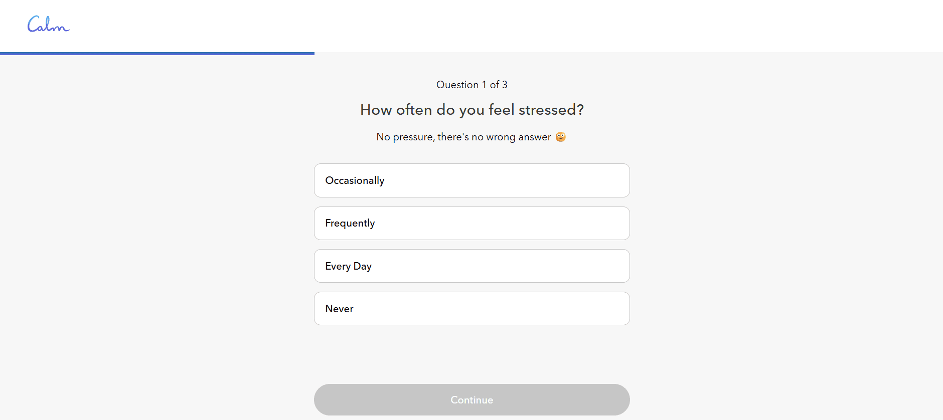
Calm Website
7. Autofill and Smart Suggestions in Forms
Let’s be real—no one enjoys repeatedly typing in their email, name, or credit card details, especially on mobile, where form fields are much smaller and harder to click.
This is why autofill forms are now the standard for most sites. Instead of retyping information, browsers and AI will remember your details to fill out the forms for you automatically.
Google Developer Website
Some forms also have smart suggestions, where their AI will study your user data to give you relevant suggestions or options.
Hubspot Website
This trend has been gaining popularity as users aim to get the most convenient option whenever possible. This helps reduce friction in form completion and boosts conversion.
8. Micro Interactions in Forms
Micro interactions, AKA the small animations or visual cues that you see on loading pages or homepages, are now turning forms into a more engaging and fun experience.
Some micro interactions you may see are animated checkmarks, subtle shaking when you input a wrong detail, changing the color of a completed section, or progress indicators.
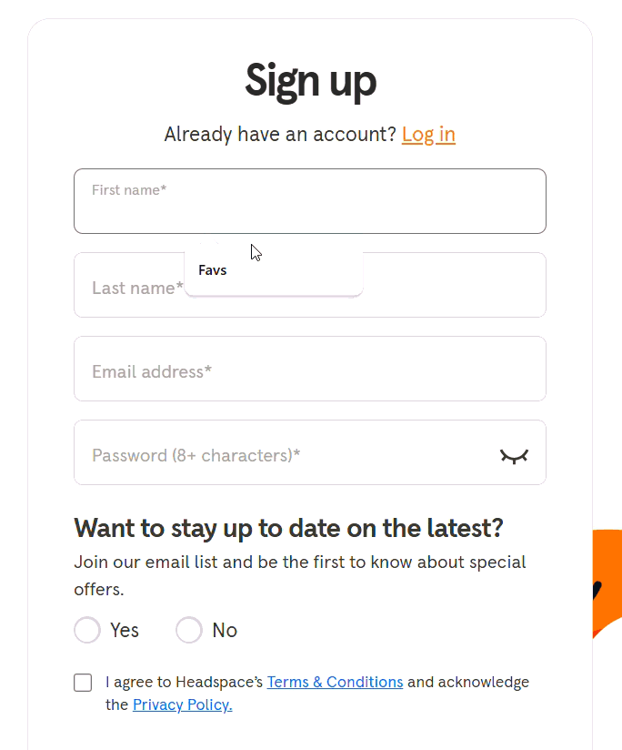
Headspace Website
Remembear Website
This not only adds personality and a bit more spice to boring form-filling but also provides helpful feedback, cues, and visual guides to users to help them complete forms properly.
9. Accessibility as a Standard
Accessible websites and forms are not just a trend but a responsibility.
You can see this in the rise of color contrast options, dark mode toggles, screen reader compatibility, voice-assisted options, and keyboard accessible controls.
Some examples of accessible websites are Scope and RNID. Scope has a high color contrast ratio of 9.66:1 between its logo design and page background, exceeding the WCAG’s minimum requirement of 4.5:1. Because of this high contrast, it’s easier for users with visual impairments to navigate their site.
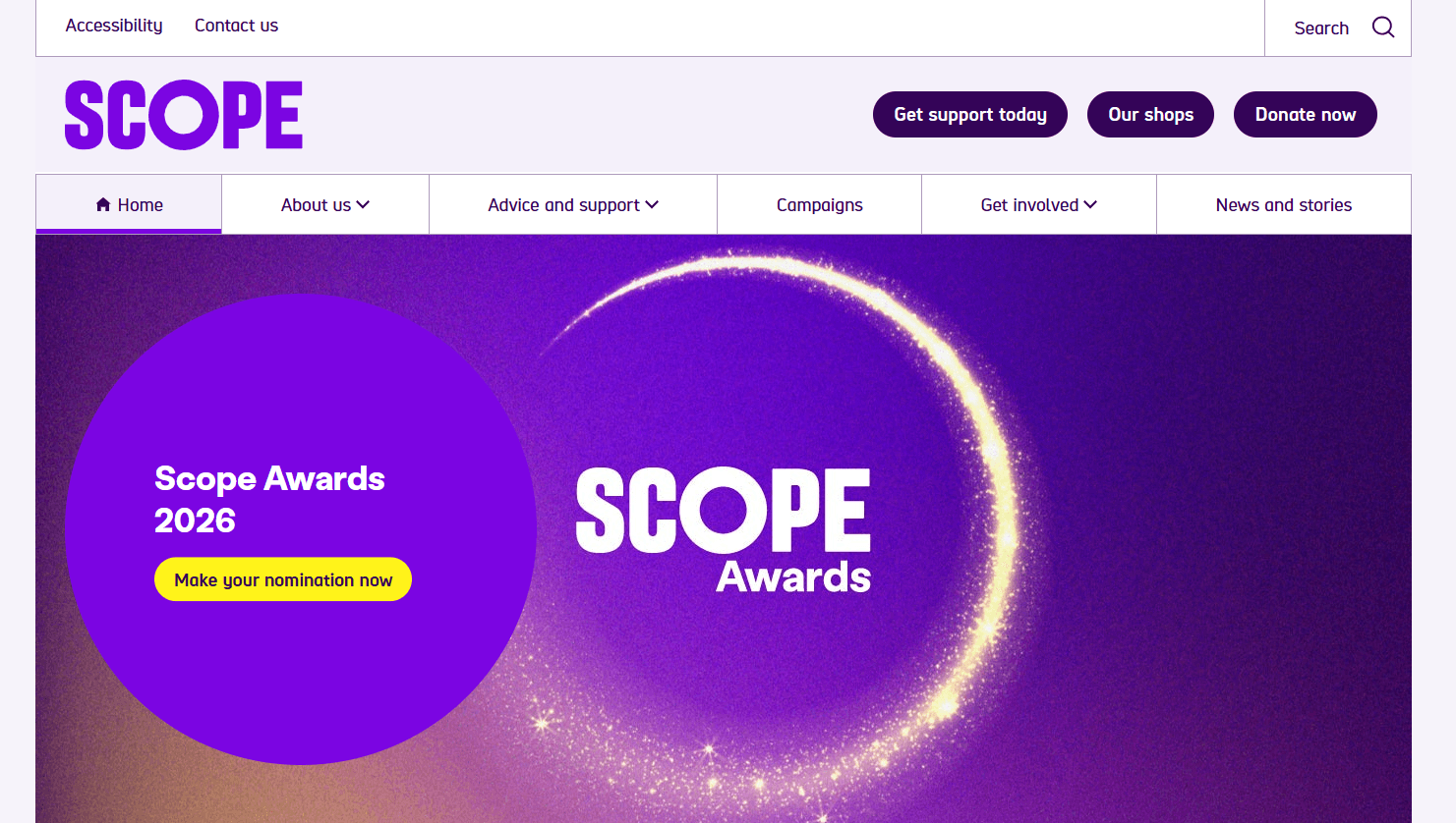
Scope Website
RNID, on the other hand, allows users to increase the text on their website by up to 300% without disrupting the experience or layout. This makes it easier for low-vision users to read through their site.
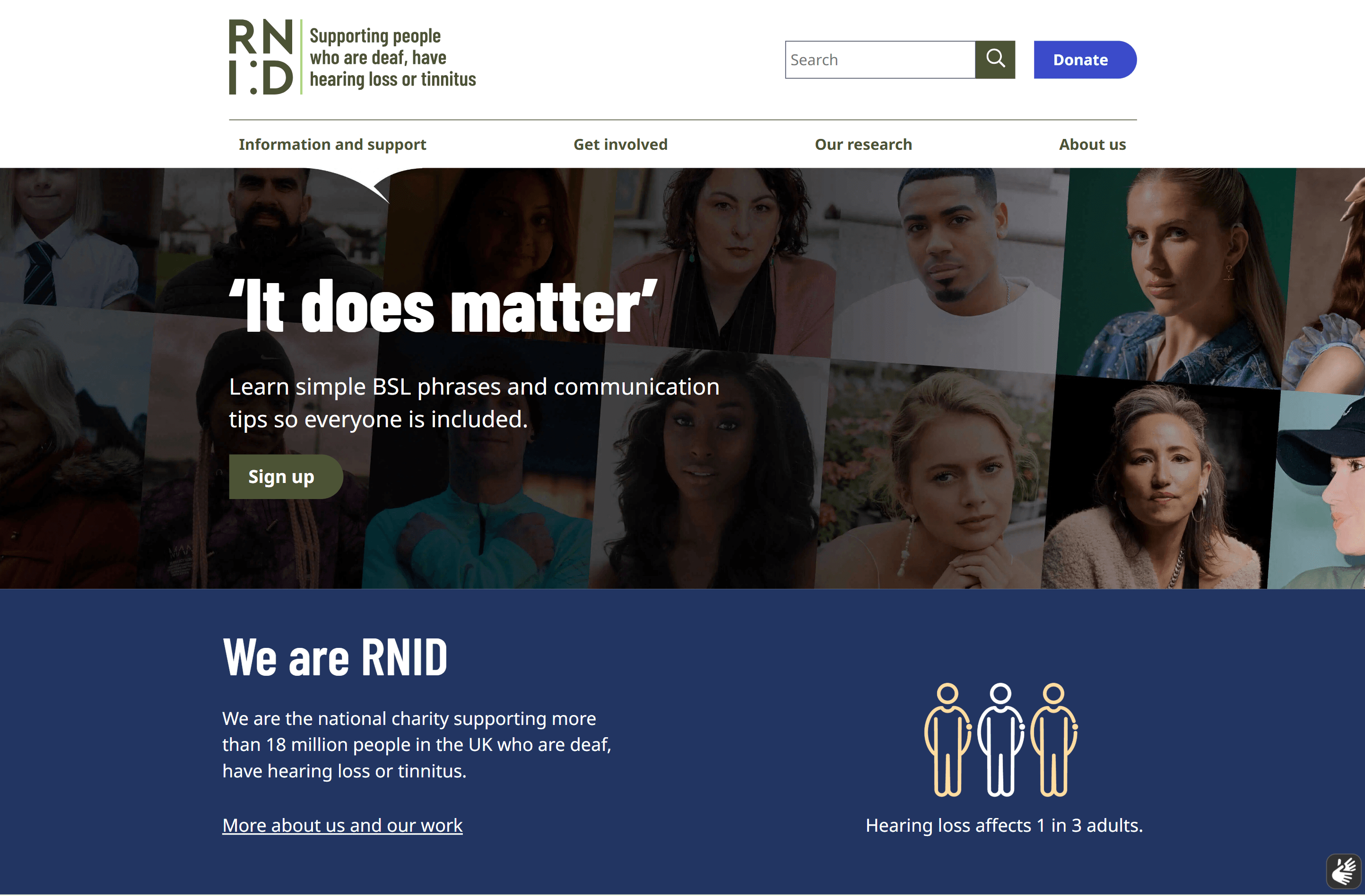
RNID Website
Even forms are more accessible. Forms are now designed for maximum clarity, with larger clickable fields, more legible text, more visual cues, and error messages or instructions that clearly state what is needed to be done.
Mailchimp Website
This not only makes the user experience easier and more seamless but also sends the right message to your users that you want your space to be inclusive and accessible to all.
10. Trust and Security
With the amount of interactions, information exchange, and payments we do online, it’s no wonder people are getting more apprehensive about the security of websites and forms.
Design can play a huge role in establishing your credibility and legitimacy. You can incorporate trust signals like SSL certificates, visible privacy policy terms, trust center pages, customer testimonials, or third-party endorsement badges. Even visual cues like padlocks, keys, shields, or thumbs-up icons can help add a sense of security to your site.
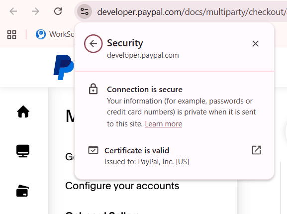
Paypal Website
Forms, in particular, can feel scary or risky for some people since they collect personal information. Some ways you can reassure your users are to only request the necessary details, give context on why you need information, have clear instructions, and assure them that their data is safe and will be handled responsibly. This way, your users will feel more at ease with filling out your forms.
Conclusion
Even with the rise of AI and all our leaps in technology, it’s clear that people are still craving that immersive and personal experience.
You can see that in the trends above. It’s not just about looking cool and creative (though that is a great thing as well!) but rather about making the web experience feel more engaging, seamless, and “human.”
Whether you’re launching a new brand or refreshing your current website, remember the trends we listed. Balance usability with creativity, and you'll be a step closer to creating a website that people want to come back to every time. To put these ideas into action and design smarter forms with less effort, signup to Formester today.


