Have you ever had a web form on your website, all set and ready for your audience to fill out, but then it just sat there, untouched? 🙄
Or, to put it differently, have you ever felt a bit like this when you're waiting for responses from your web forms:

Well, unfortunately, you might be dealing with what we call "web form abandonment." 😔
What Is Web Form Abandonment?
Web form abandonment refers to the situation where a user begins to fill out a web form on a website but, for some reason, does not complete and submit the form.
This can occur at any stage of the form-filling process, from the moment the user starts entering information to just before they click the final submit button.
Web form abandonment can have a negative impact on businesses and websites, as it means potential leads, customers, or valuable data may be lost.
According to Baymard Institute statistics (2018), average form abandonment rates are around 81.40%.
Understanding User Psychology: Why Users Might Be Abandoning Your Forms?
Users may express various sentiments or concerns before or when they decide to abandon a web form.
These sentiments often reflect their frustrations, doubts, or reasons for not completing the form.

Understanding these potential user sentiments can help website designers and developers address these issues and optimize web forms to reduce abandonment rates and improve the overall user experience).
Here are some things a user might say or think before abandoning a web form:
- This form is too long: Users may feel overwhelmed by the number of fields and the time it would take to complete the form.
- It's not worth the effort: Users might question whether the benefits or value they'll receive from completing the form outweigh the time and effort required.
- I don't have the information: Users may not have all the necessary information or details on hand to complete the form, leading to frustration.
- It's too confusing: Complex or poorly designed forms can confuse users, making them uncertain about how to proceed.
- I'm concerned about privacy: If the form requests sensitive or personal information and doesn't provide adequate reassurance about data security, users may hesitate to continue.
- I made a mistake: Users might realize they made a mistake while entering information and either feel unsure about how to correct it or not want to invest the effort to fix it.
- I'll do it later: Some users might intend to return to the form later but never actually come back to complete it.
- I found what I needed elsewhere: If users find an alternative solution or source that doesn't require filling out a form, they may abandon the form in favor of that.
- Technical issues: If the form or the website experiences technical problems, users may give up and abandon the process.
- I got distracted: External distractions, such as phone calls, messages, or other notifications, can divert users' attention away from the form.
How To Identify If Your Web Form Is Being Abandoned?
Identifying whether your web form is experiencing abandonment involves monitoring user behavior and analyzing data.
This information will enable you to make data-driven improvements to increase form completion rates and enhance the overall user experience.
Here's how to do it:
1. Conversion Tracking
Use web analytics tools like Google Analytics to set up conversion tracking for your web form. Create a specific goal or event that triggers when users successfully submit the form.
Monitor the number of conversions (form submissions) and compare it to the number of visitors who accessed the form page.
A significant gap between visits and conversions may indicate abandonment.
2. Bounce Rate
Check the bounce rate for the page where your web form is located. A high bounce rate suggests that visitors are leaving the page without taking any further action, possibly due to form abandonment.
3. Form Analytics Tools
Utilize specialized form analytics tools like Hotjar, Zuko (formerly, Formisimo), or Crazy Egg. These tools provide detailed insights into user interactions with your web form, including form field abandonment and completion rates.
4. User Session Recordings
Use session recording tools like FullStory or Mouseflow to watch recordings of user sessions on the form page. Look for sessions where users start filling out the form but don't complete it.
5. Form Abandonment Reports
If you use a customer relationship management (CRM), like Zoho CRM or a marketing automation system, like Marketo, they often provide form abandonment reports. These reports track the behavior of users who initiate but do not finish filling out your forms.
6. Time Spent on Page
Analyze the average time users spend on the form page. If users leave the page quickly, it may indicate that they are not engaging with the form.
7. Google Analytics Behavior Flow
Use Google Analytics' Behavior Flow report to visualize user paths on your website. Identify where users drop off during the form-filling process.
8. Exit Intent Pop-ups
Implement exit-intent pop-ups or surveys that appear when users are about to leave the form page. Ask users why they are abandoning the form to collect feedback.
9. A/B Testing
Run A/B tests with variations of your web form to see which design or content changes lead to higher completion rates. Analyze the results to identify areas of improvement.
10. Segmentation
Segment your audience data based on traffic sources, device types, or demographics. This can help identify if specific user groups are more prone to form abandonment.
11. Feedback and Surveys
Collect user feedback through on-page surveys or follow-up emails. Ask users about their experience with the form and reasons for abandonment.
The Impact Of Web Form Abandonment On Your Business
The cost of web form abandonment can be substantial for businesses and organizations.
As already stressed upon, in the previous section, by analyzing data and trends related to form abandonment, you can gain a better understanding of its impact and take steps to reduce it, ultimately minimizing the associated costs.
While it may not always be easy to quantify the exact financial impact, several factors contribute to the overall cost:
1. Lost Leads and Conversions
The most direct cost of form abandonment is the loss of potential leads and conversions. When users abandon a form, they often do not complete a desired action, such as signing up for a newsletter, making a purchase, or requesting information.
2. Reduced Revenue
Abandoned e-commerce checkout forms can result in lost sales and revenue. When customers leave the checkout process without completing a purchase, it directly affects the bottom line.
3. Wasted Marketing Spend
If you're running online advertising or marketing campaigns to drive traffic to your website, each click that leads to an abandoned form represents wasted advertising spend.
4. Resource Allocation
Businesses may spend resources (time, money, and effort) to drive traffic to landing pages with forms. If those forms have high abandonment rates, it means resources are not being used efficiently.
5. Reputation and User Experience
Poor user experiences due to form abandonment can harm your brand reputation. Users may view your website as frustrating or untrustworthy, leading to a loss of potential long-term customers.
6. Data Incompleteness
Incomplete forms can result in missing or inaccurate customer data, affecting your ability to personalize marketing efforts and customer interactions.
7. Customer Retention
If customers abandon forms when trying to access support or resolve issues, it can negatively impact customer satisfaction and retention.
8. Opportunity Costs
Every user who abandons a form represents a missed opportunity to engage, convert, or gather valuable data. The long-term opportunity costs can be significant.
What Are Single-Page Web Forms?
Single-page forms, as the name suggests, are web forms that are designed to be completed on a single web page, without the need for users to navigate to different pages or sections to submit their information. These forms are often used to collect data, capture leads, process transactions, or enable user interactions efficiently and in a user-friendly manner.
Key Features of Single-Page Forms
1. Compact and Concise
Single-page forms are typically shorter and more concise than multi-page forms, focusing on essential information.
2. User-Friendly
They are easy to understand and complete, with all fields visible on a single page, eliminating the need for navigating between pages.
3. Improved Conversion Rates
Single-page forms often result in higher conversion rates because they reduce friction and simplify the form-filling process.
4. Real-Time Feedback
Real-time validation and error messages provide immediate feedback, helping users correct mistakes as they fill out the form.
5. Engaging Design
Single-page forms allow for creative and visually appealing designs that guide users through the process.
6. Progress Indicators
They include progress indicators, such as progress bars or step numbers, to inform users about their position in the form.
7. Mobile Optimization
Single-page forms can be fully responsive and mobile-friendly, ensuring a seamless experience on all devices.
How To Reduce Web Form Abandonment Rate With Single-page Forms?
Single-page forms can help reduce web form abandonment by simplifying the form-filling process and creating a user-friendly experience. Here's how single-page forms can contribute to lower abandonment rates:
1. Simplicity
Single-page forms are concise and straightforward, presenting all required fields on a single page. Users can see the entire form at once, eliminating the need for navigation between multiple pages.
2. Reduced Friction
With fewer clicks and page transitions, single-page forms minimize the friction users typically encounter in multi-step forms. This streamlined experience encourages users to complete the form.
3. Clear Progress Indicators
Single-page forms often include progress indicators, such as progress bars or step numbers. These indicators show users how far they've come in the form-filling process, giving them a sense of achievement and motivating them to finish.
4. Mobile Optimization
Single-page forms can be designed to be fully responsive and mobile-friendly. This ensures that users on smartphones and tablets have a seamless experience, reducing abandonment rates among mobile users.
5. Engaging Design
Creative and visually appealing designs make single-page forms more engaging and user-friendly. Users are more likely to complete forms that are visually inviting.
6. Efficiency
Users can complete single-page forms quickly because they don't have to navigate through multiple pages. This efficiency makes the form-filling process feel less time-consuming.
7. Flexibility
Single-page forms can still incorporate conditional logic to show or hide fields based on user responses. This customization tailors the form to each user's needs, making it more relevant and likely to be completed.
8. Psychological Effect
The transparency of single-page forms, where users can see the entire process upfront, can reduce anxiety about the form's length and complexity. This psychological effect can encourage users to start and complete the form.
9. Data Accuracy
Real-time validation and immediate error feedback help ensure data accuracy. When users see errors as they occur, they are more likely to correct them rather than abandoning the form due to frustration.
10. Reduced Abandonment Points
Single-page forms have fewer opportunities for users to abandon, as there are no page transitions. Users are more likely to complete the form in one continuous session.
11. Improved User Experience
The overall user experience is enhanced with single-page forms. Users find them more user-friendly and less daunting, which translates to lower abandonment rates.
Tips For Designing An Effective Single-page Form
1. Start with a Clear Purpose
Begin the form design process by defining a clear and specific purpose.
Ask yourself: What is the primary goal of this form? What information or action do you need from users?
Establishing a precise purpose ensures that your form is focused and aligns with your objectives.
Example: This simple Opt-in Form lets users sign-up in exchange for receiving free tips.
2. Prioritize Essential Fields
Keep your form concise by including only the most essential fields.
Avoid overwhelming users with a barrage of questions that may deter them from completing the form.
Prioritizing crucial information is essential for achieving a higher completion rate.
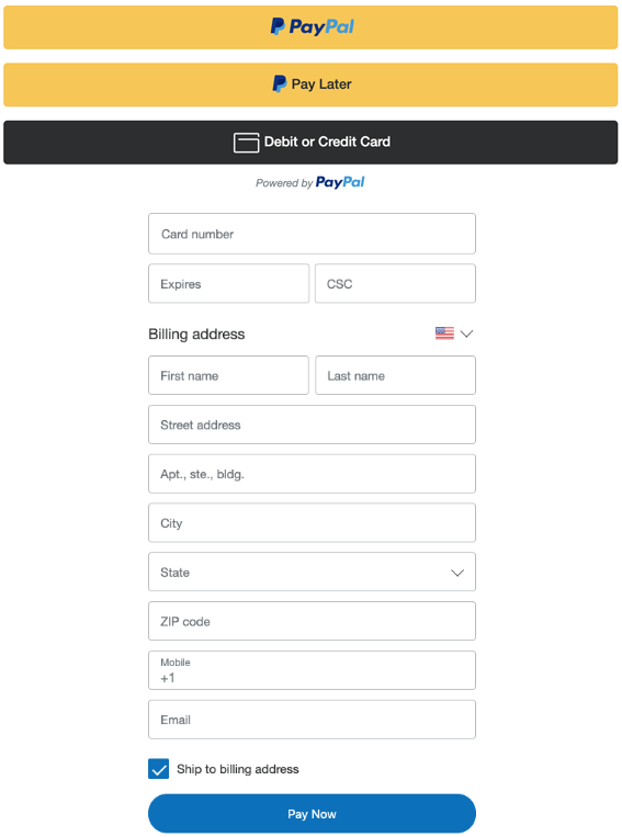
Example: PayPal's checkout form prioritizes essential fields related to payment and shipping information. By emphasizing these key details, the form streamlines the online shopping process, reducing cart abandonment.
3. Group Related Fields
Organizing fields into logical groups or sections with clear headings enhances the user experience.
This structured approach helps users understand the form's flow and what is expected in each section, reducing confusion.
Use Form Headers to accomplish this.
4. Utilize Progressive Disclosure
Implement progressive disclosure to display additional fields or options based on user responses.
This strategy keeps the initial form view clean and uncluttered, adapting to users' choices and preferences.
You can use conditional logic to accomplish this.
Example: SurveyMonkey's survey form employs progressive disclosure by revealing questions one at a time as users progress. This gradual approach minimizes cognitive load, allowing users to focus on one question at a time.
5. Mobile Optimization
In today's mobile-centric world, ensure that your single-page form is fully responsive and functional on various screen sizes.
Extensive testing on smartphones and tablets guarantees a seamless experience for mobile users, reducing abandonment rates in this crucial demographic.
6. Engaging Visuals
Enhance the visual appeal of your form with engaging elements like icons, illustrations, and carefully chosen images. Visuals not only make the form more attractive but also serve as visual cues to guide users through the form.
Example: Canva's signup form uses engaging visuals that reflect the platform's design-oriented brand. These visuals not only capture users' attention but also convey the platform's creative nature.
7. Clear and Concise Labels
Craft clear and concise labels for each field, ensuring that users immediately understand what is expected without any ambiguity.
Label clarity is essential for an efficient and user-friendly form.
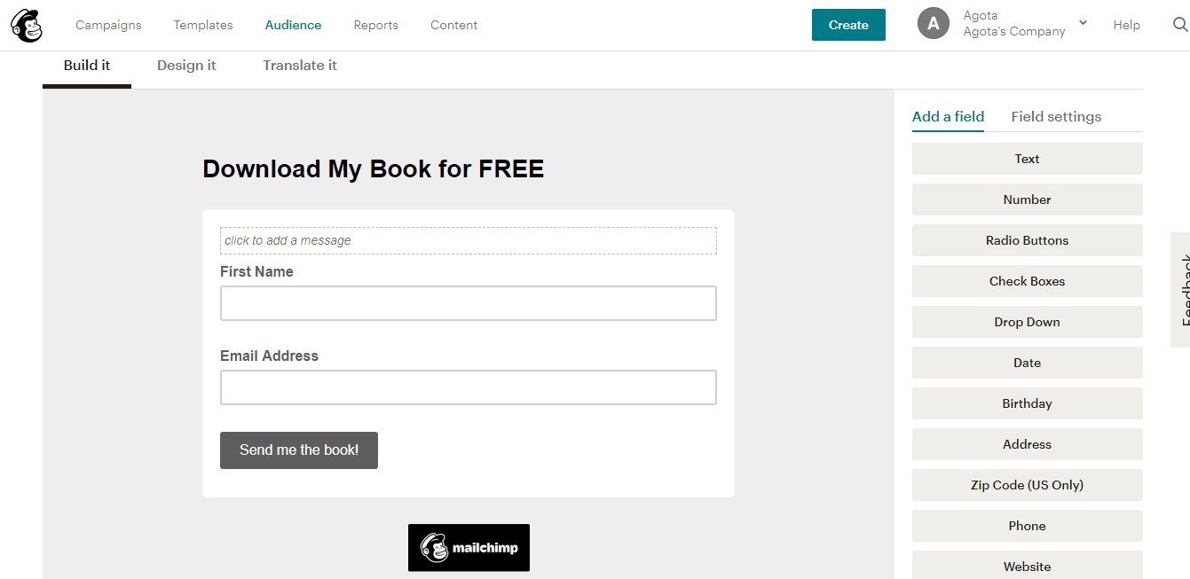
Example: Mailchimp's email list creation form is a shining example of clear and concise labels. Each field is labeled straightforwardly, and the minimalistic design promotes user understanding and completion.
8. Progress Indicators
Employ progress indicators, such as progress bars or step numbers, to inform users about their position in the form-filling process.
These indicators provide a sense of direction, achievement, and motivation to finish the form.
Example: LinkedIn's profile creation form prominently displays a progress bar, indicating the completion status. Users can see how much of the form they've filled out, encouraging them to complete the process.
9. Real-Time Validation
Implement real-time validation to detect errors as users type.
Provide immediate feedback and suggestions for correction. This feature prevents users from submitting incorrect or incomplete information.
Example: Google's account creation form offers real-time validation for password strength.
If a user's chosen password doesn't meet security requirements, the form provides immediate feedback on how to create a stronger password.
10. Effective CTA (Call to Action)
Place a clear and compelling CTA button with action-oriented text that conveys what will happen when users click it.
The CTA should be prominent and motivate users to take the desired action.
Example: Shopify's single-page checkout form features a prominent "Complete Purchase" CTA button.
The button's text leaves no room for ambiguity, guiding users toward the final step of completing their purchase.
11. Privacy and Trust Assurance
Include a brief statement about data privacy and security to reassure users.
Display trust badges or security certifications if applicable.
Building trust is crucial for encouraging users to share their information.
Example: E-commerce platforms often include trust badges during checkout. For instance, a padlock icon and a statement about secure payment methods reassure users and enhance trust in the transaction.
12. User Testing
Conduct usability testing with real users to identify any pain points or areas where users might get stuck.
Collect feedback and observations from users to make informed improvements to the form's design and functionality.
13. Performance Optimization
Ensure that your form loads quickly and efficiently.
Slow-loading forms can lead to user frustration and abandonment.
Optimize images, code, and server response times to provide a smooth experience.
14. Feedback, Iteration and Follow-up
Continuously gather user feedback and analyze form analytics to identify areas for improvement.
Make data-driven decisions to enhance the form's effectiveness.
Regularly iterate on the design and functionality based on insights from user interactions.
Moreover, it is also important to reach out to users who have abandoned their forms. Send them follow-up messages and reminders, encouraging them to complete the form.
Did you know - 19% of people will return to complete a form if the company reaches out to re-engage them.
By providing a simplified, efficient, and engaging form-filling process, single-page forms can significantly reduce web form abandonment rates.
However, it's essential to design these forms thoughtfully, considering user needs and objectives, to achieve the best results.
Regular monitoring and optimization based on user feedback and data analysis can further enhance the effectiveness of single-page forms in reducing abandonment.
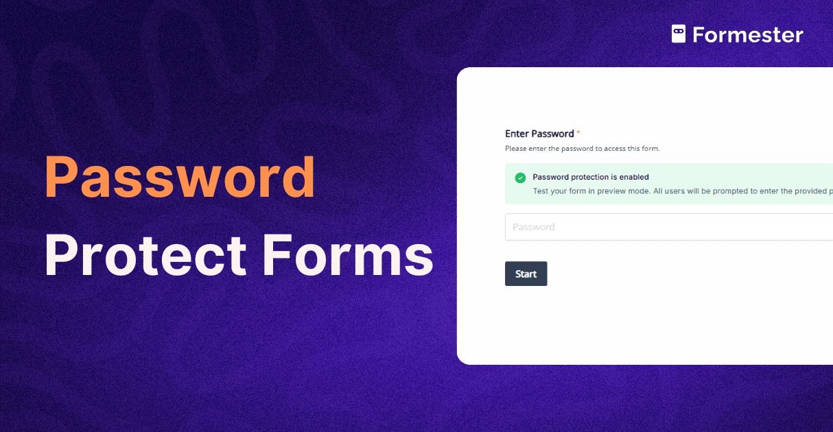
How to Create a Single-page Web Form Using Formester?
Creating a single-page web form using Formester is a simple, time-efficient and fun process.
Ultimately, you get a web form that drives leads and conversions, and your users find it easy to fill!
Follow these step-by-step instructions to get your form up and running:
Step 1: Sign In or Sign Up
Sign In: If you already have a Formester account, just sign in with your credentials.
OR;
Sign Up: If you're new to Formester, click on the "Sign Up" button to create a new account.
Follow the prompts to provide your email, password, and other required information.
Step 2: Start a New Form
- After signing in, you'll land on your Formester dashboard.
- Click the "Create New Form" button to begin creating your single-page web form.
OR;
Choose a Template: Formester provides a selection of templates to kickstart your form creation. Select any form that matches your design expectations, and simply make minor branding edits, to personalize your form as per your own brand!
Step 3: Select Form Type
Next, you'll be redirected to the Form Details page,
Here, you may give a name to your form, and select the type of service you want from the form, i.e., Drag-and-drop or Form Backend.
Next, under the Type of Form Section, select Single Page.
Note: You may always update the above, from the settings section, on your form dashboard.
Step 4: Build Your Form
After making the above choices and settings, all you have to do is design your form!
- Now, you'll be in the form builder interface. Here, you can add various form elements like text fields, multiple-choice questions, checkboxes, and more.
To add an element, simply drag and drop it onto your form canvas.
- Customize each form element by clicking on it.
You can edit the question, add options, and configure conditional logic if needed.
- Continue adding and configuring elements until you've built your entire form on one page.
You can arrange and organize elements as you see fit.
Step 5: Design and Branding
Make your form visually appealing by customizing its design. You can change colors, fonts, and add your logo or branding elements to match your website's look and feel.
Step 6: Save, Preview and Test
Once you've designed your form, simply hit the Save button, so your form is saved.
Note: You may use the Save button at any point during your form-creation process.
Next, before publishing your form, click the "Preview" button to see how it will appear to users.
Test the form to ensure that all questions and interactions work as expected.
Step 7: Publish Your Form
Once you're satisfied with your form, click the "Publish" button to make it accessible to users.
Formester will provide you with a link that you can share on your website or through other channels.
You may even embed the form to your website.
Step 8: Monitor Responses
As users start filling out your form, you can track responses in real-time within the Analytics Section of your account's dashboard.
You can also set up email notifications to receive new responses instantly.
And that's all!
You've successfully created a single-page web form using Formester.
Users can now access and submit responses through the link you provided, and you can manage and analyze the collected data within your Formester account.
Moreover, using the Auto-responder feature, you may also send automated acknowledgement and thank you messages to your form responders!
Conclusion
In today's digital age, web forms have become the backbone of online interactions for businesses. They help gather crucial information, engage customers, and drive conversions. But there's a common headache that businesses face - web form abandonment. It's that frustrating moment when users start filling out a form but, for various reasons, never finish the job. It's a missed opportunity, plain and simple.
Web forms come in all shapes and sizes, from contact forms to registrations and surveys. Each serves its unique purpose. But here's the rub: when users encounter lengthy, complicated forms, they often throw in the towel. That's where single-page web forms come to the rescue.
Single-page web forms are like the express lane at the supermarket. They're designed for speed and efficiency. By putting all the necessary fields and questions on one page, they eliminate the frustrating back-and-forth between pages. These forms simplify the process, reduce frustration, and make users happy campers. They're the ultimate solution to web form abandonment.
Now, don't get us wrong; multi-page forms have their place, especially for in-depth data collection like surveys and research forms. But when it comes to everyday use, single-page forms steal the show by conquering the challenge of web form abandonment.
And here's where it gets even better - meet Formester. Formester is your secret weapon for creating web forms with ease. It's a breeze to use, with a drag-and-drop interface that lets you build fun and user-friendly single-page web forms in minutes. Plus, it's flexible enough to customize forms for your unique needs.
Say goodbye to web form abandonment blues and hello to more form responses.
Try Formester today and discover just how easy form creation can be. It's time to turn missed opportunities into conversions, one form at a time.


